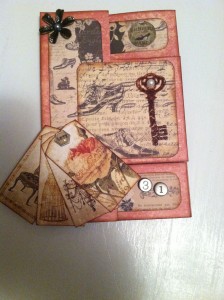
My almost final card for 2013 is for another daughter’s birthday. (Still one more to go before the end of the year.) I’ve been wanting to use the Tri-shutter fold for a while now, so that was the easy part. Choosing paper wasn’t as easy. I wasn’t able to get anything specific for this (oh, the ideas I have,) so had to go with what I had. (Yep, need to use the wonderful stash on hand.) I was happy to find something with shoes on it in the stack (I love,) Kellerkurtz & Company by Paper Studio. (All my girls love shoes. So does their mama.) Anyhow, I started with shoe paper and just started adding pretties that I thought she’d like.
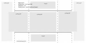
The card base is from the Old World stack from DCWV. I liked the combo of the red and neutrals. (They are generally her faves.) To make the Tri-shutter, cut the 12×12″ in half (6″x12″), then score on the short side at 2″, 4″, 8″ and 10″. Accordion fold the card and crease with your bone folder. (Look familiar? Same as Double Z card, up to this point.) Then open, and cut (on the long side) between the 2″ score and the 10″ score at 1.5″ inches from both long edges. Then refold with your middle section going the opposite direction as your top and bottom ones. Re-crease with your bone folder.
You may choose to mat different places or sizes than I did (measurements above). They aren’t all standard, but I had my reasons. I rounded the corners and inked the edges of the mats, and inked the card base too.
The embellishments on the front start with a metal flower from Queen & Co. with a flat back pearl center, and 4 small tags from a printable from Eclectic Anthology, attached with a “Love” brad from the Prima Engravers collection. The stamped key is from Prima Engravers collection. It is heat embossed and has a flat back pearl also.
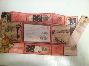
Inside, the “31” number tiles and gemstone with a shoe on it are both from Paper Studio. I took the postcard from a printable from The Graphics Fairy and added the Scripture verse to it and printed it out, then stamped it with Birthday Wishes from Inkadinkado and Flourishy from Recollections. It is mounted with foam “pop” squares on the Kraft card stock (from Recollections). The “Cherish” and “Memories” stamps are from Studio G. All the above are stamped in Rich Cocoa from Memento. The flowers are from the same Prima set as the key and are stamped in Bright Pink Stampabilities dye ink.
On the last page, the chandelier is from the same stamp set as “Cherish”. It is heat embossed, and it and the shoe are blinged with “diamond” gems. (I had every intention of putting these shoes on the front and the others on the back, but mis-glued and didn’t want to start over. Shh. Don’t tell her.) The bookmark and the pocket for it (cut from another bookmark) are a free printable from Janet K Design. I Mod Podged the bookmark so it would hold up better. The red bling is from Queen & Co. Everything is inked in, you guessed it, Vintage Photo Distress Ink from Tim Holtz.
I think I was getting predictable this week, but it goes to show you that you can reuse the same paper stacks, stamps, inks and even embellishment packs and get totally different looks from them. You don’t have to have a lot to do a lot.
What is your current go-to–whether that be paper stack, ink, stamps, punches or whatever? What do you find yourself grabbing time after time?
[subscribe2]


